bosc0 wrote:Quick thought.
Me likey. Only suggestion, would prefer with no italics and a slimmer font (Calibri or something like that) - that way, the C in the wheel looks more natural.
Also, GET DA URL RITE, FOOL



Australian Liberty Owners Club
 by alessandro132 » Thu Nov 22, 2012 9:17 am
bosc0 wrote:Quick thought.

by bosc0 » Thu Nov 22, 2012 9:42 am
Ric wrote:bosc0 wrote:Quick thought.
Wrong URL!

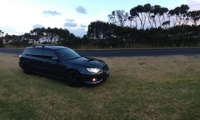
by alessandro132 » Thu Nov 22, 2012 9:48 am

by zch91 » Thu Nov 22, 2012 1:34 pm
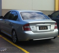
by seanmau5 » Thu Nov 22, 2012 7:31 pm
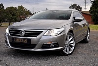

by cruisn » Thu Nov 22, 2012 8:08 pm
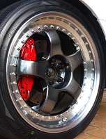

by shav » Fri Nov 23, 2012 9:12 am
bosc0 wrote:Quick thought.
by Ric » Fri Nov 23, 2012 10:33 am
 cards.pdf

by shav » Fri Nov 23, 2012 11:18 am
Ric wrote:I like Jake's design too, but if we want the option to print at home, that's going to use a lot of ink/toner, and maybe cause the paper to ripple.
A negative image looks almost as good.
I've made a sheet with cut marks you can print yourself. What do you think?
by Jack_Keaka » Fri Nov 23, 2012 11:51 am
by bosc0 » Fri Nov 23, 2012 11:58 am

by Corsair » Fri Nov 23, 2012 12:36 pm
by Jack_Keaka » Fri Nov 23, 2012 2:00 pm
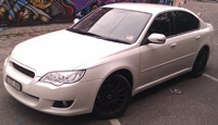
bosc0 wrote:It's not a wagon... the lines are extended is all.
PS Gen3's are gay
 so I've been told.
Users browsing this forum: No registered users and 8 guests